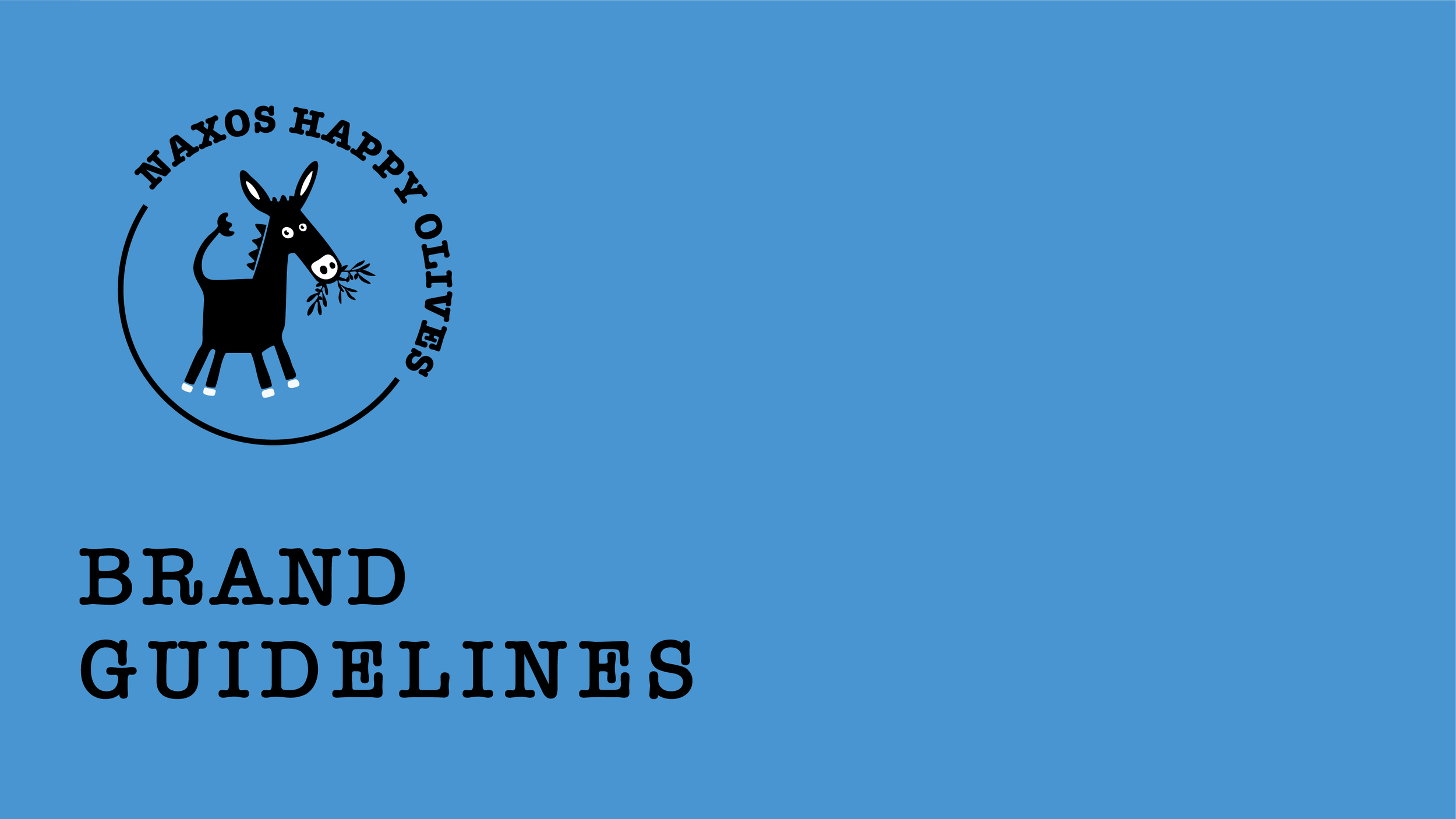

Packaging and identity for a sustainable olive oil producer on Naxos, developed from hand-drawn illustration into a cohesive print system.
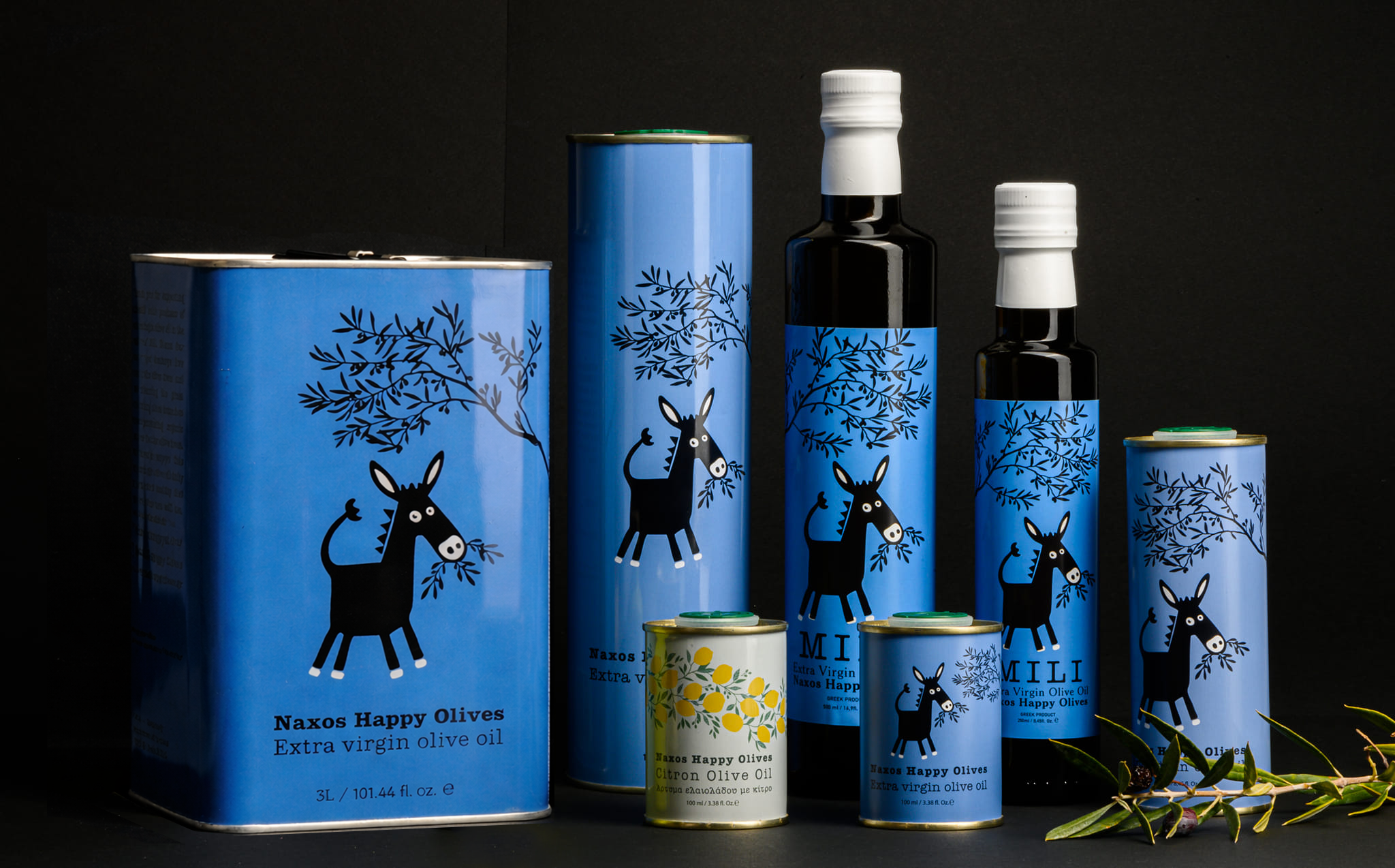
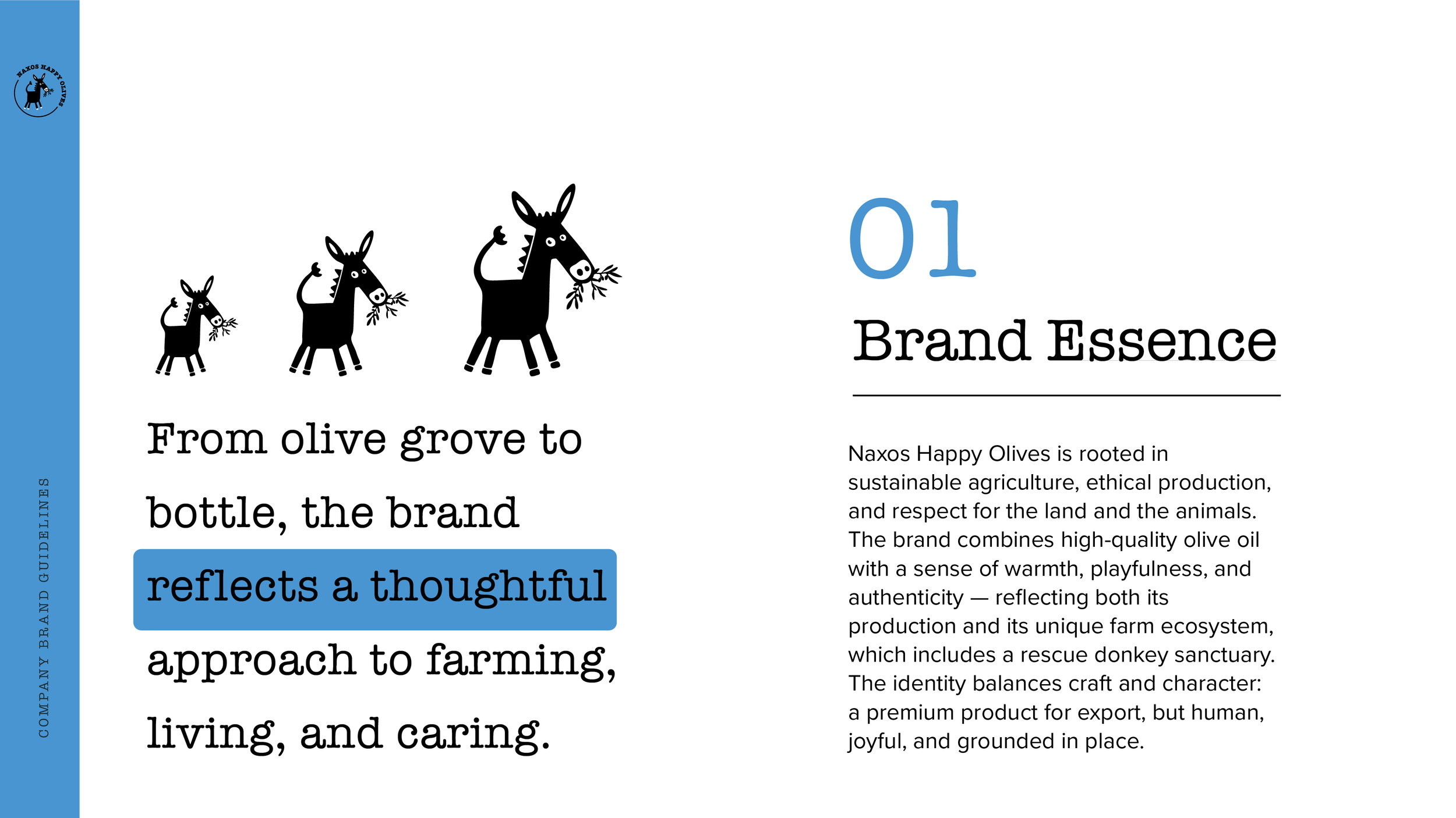
Naxos Happy Olives is an olive oil DTC company based in Naxos, Greece, rooted in sustainable farming and ethical production. The brand operates within a unique agricultural ecosystem that includes a rescue donkey sanctuary, reflecting a holistic approach to land stewardship, animal welfare, and food production.
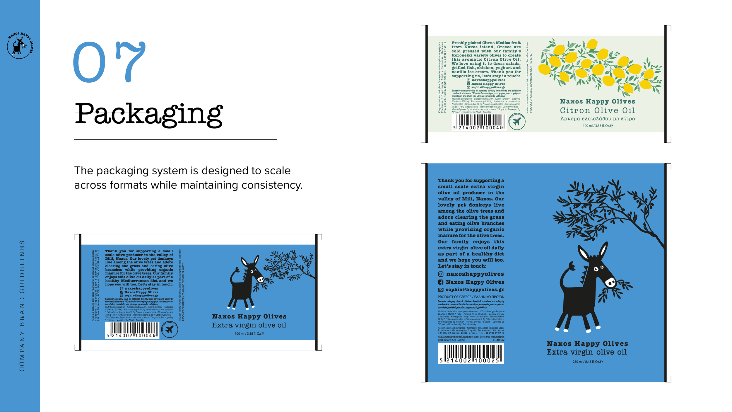
As the business grew, the producer expanded beyond its core extra virgin olive oil to introduce Citron Olive Oil — a limited-batch citron olive oil pressed with Citrus Medica, a rare local fruit. The challenge was to create a unified brand system that could support growth, exports, and product extensions while staying true to the farm’s values and story.
Lead designer
Brand identity, illustration development, packaging design, and visual system creation across multiple products, including export-ready formats.
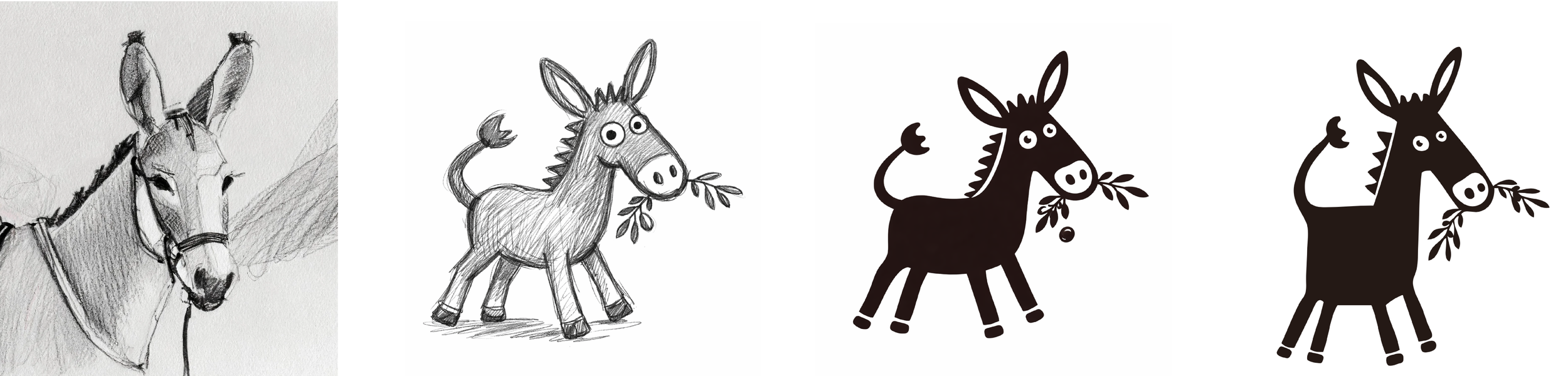
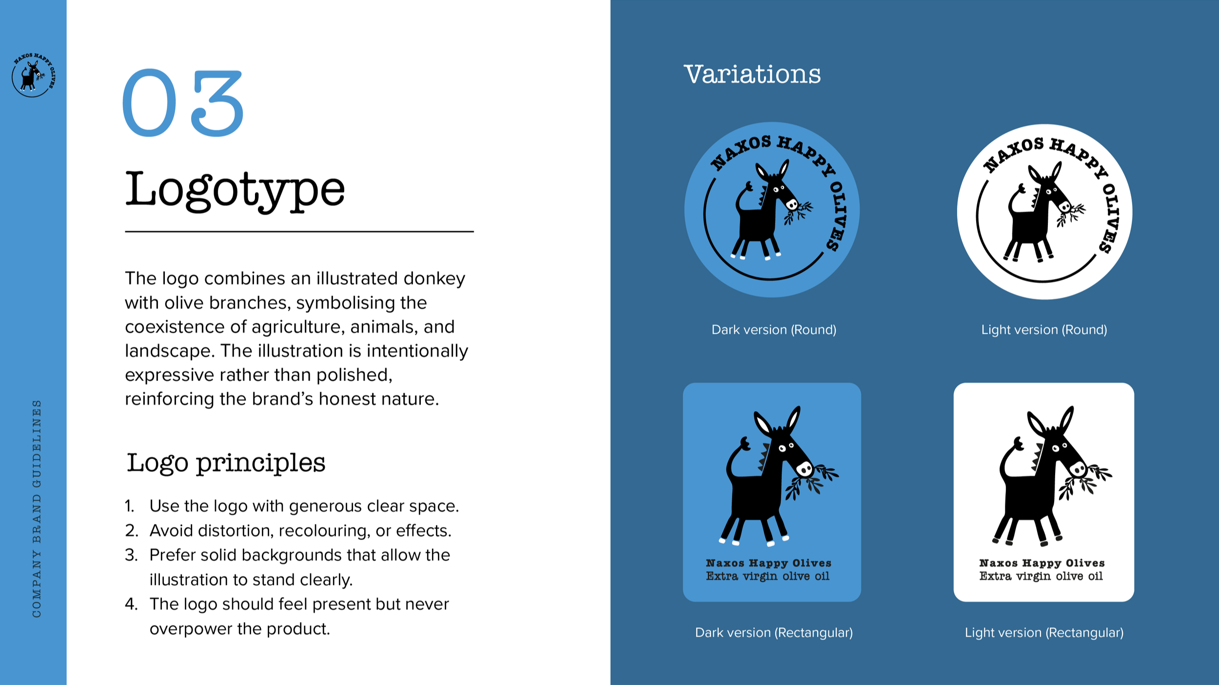
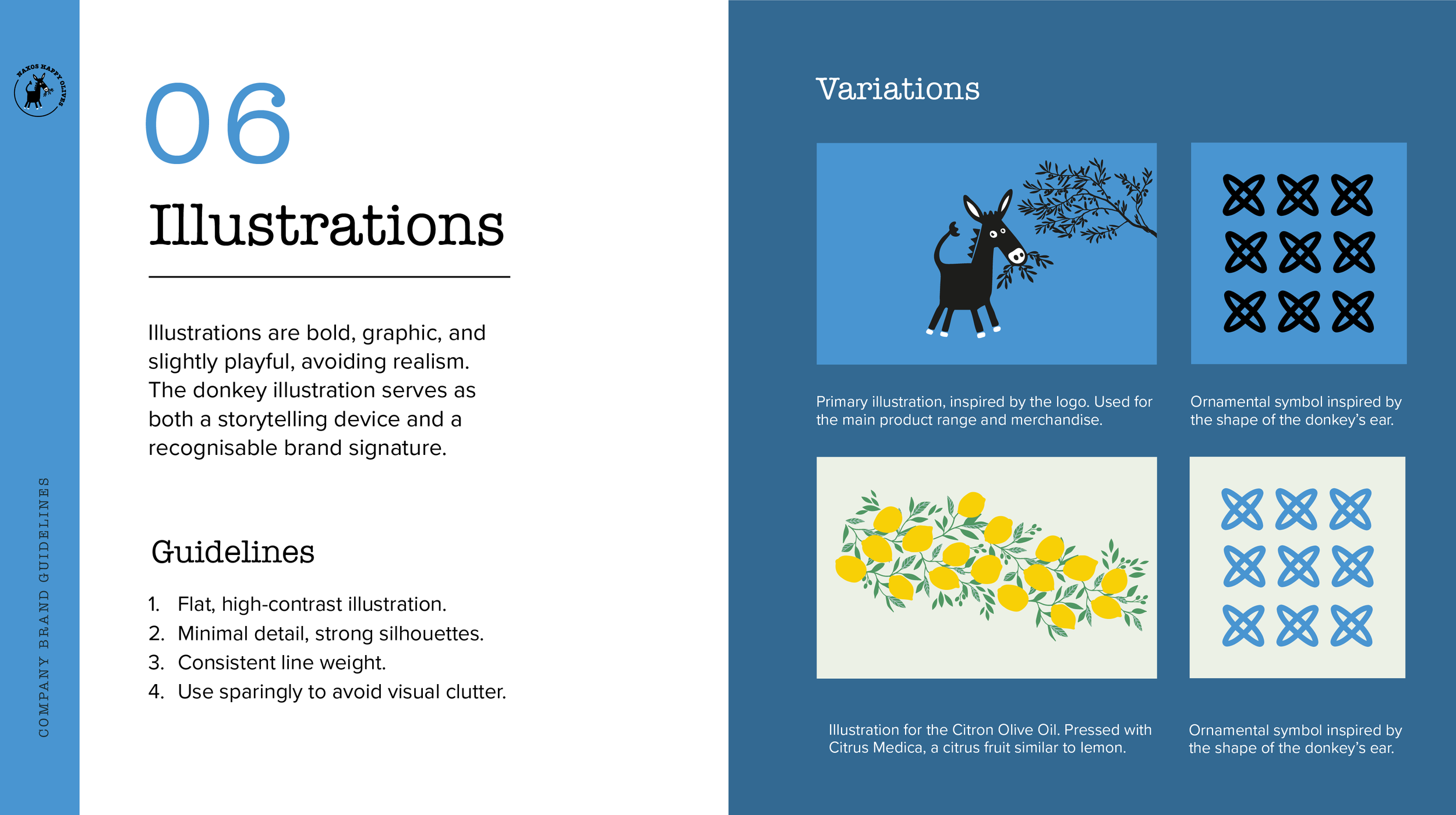
The identity was designed to feel expressive yet grounded — balancing warmth, character, and clarity. At its core is an illustrated mark combining olive branches and donkeys, quietly referencing the farm’s ecosystem and reinforcing the brand’s ethical foundation.
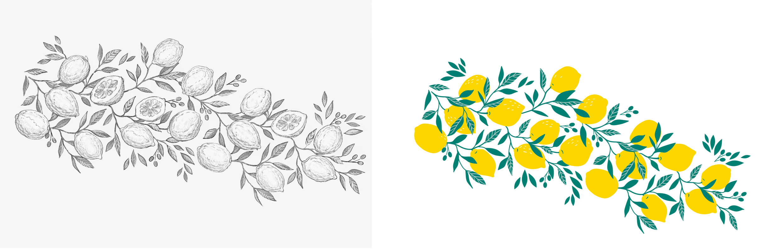
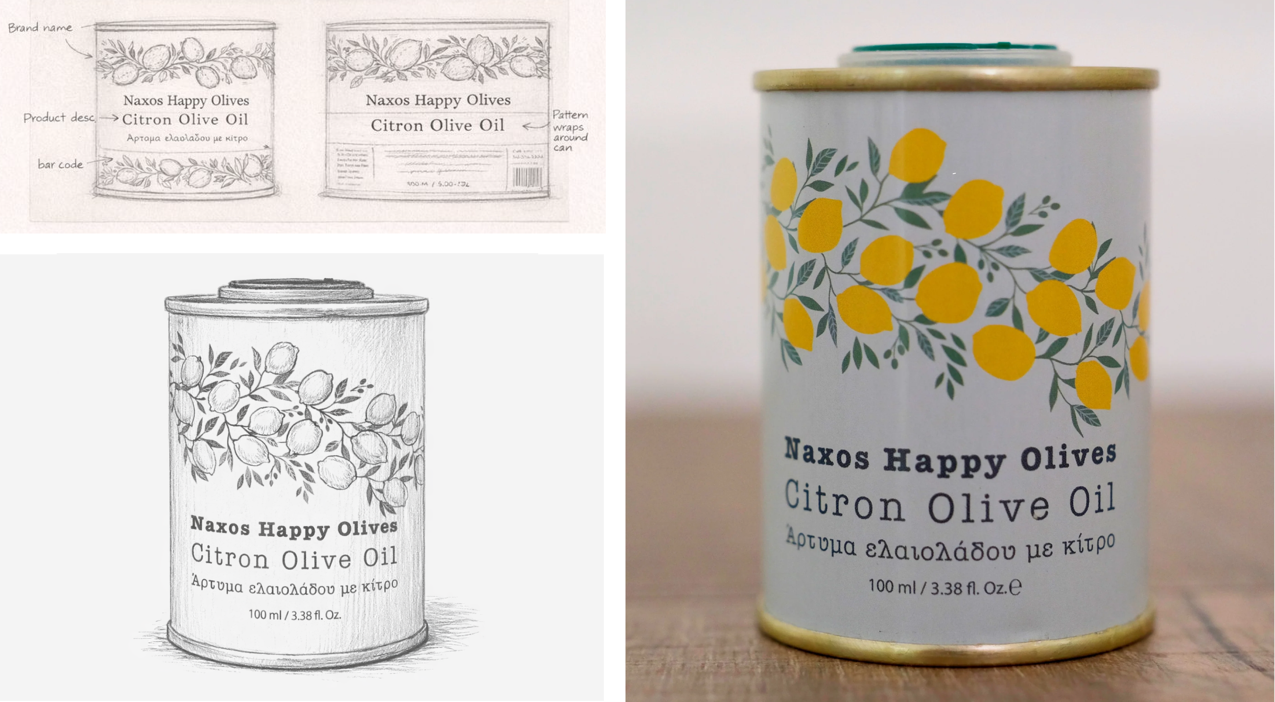
For Citron Olive Oil, the design evolved as a variation within the same family. Hand-drawn lemon and olive tree branch studies provided the foundation for a repeatable pattern that would wrap the tin without overwhelming the label text.
Early structure explorations tested hierarchy, placement of brand elements, and how the pattern could wrap the cylinder form while keeping readability and print constraints in mind. Colour exploration tested vibrancy and cohesion, leading to a balanced palette that feels fresh yet refined.
A cohesive brand and packaging system that supports both storytelling and commercial growth.
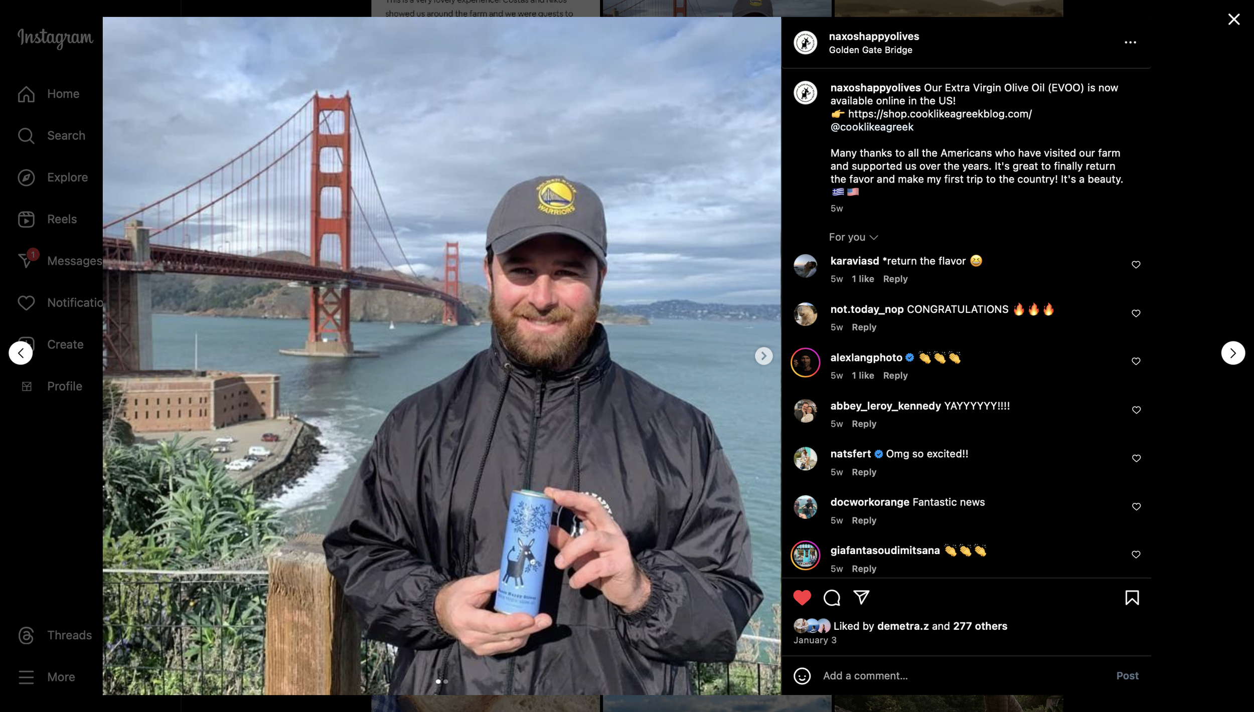
Naxos Happy Olives has successfully expanded into international markets, with over 100,000 tins sold, demonstrating the scalability and strength of the identity.
The system allows for future product extensions while preserving a strong, recognisable core — positioning the brand as a premium, ethically produced olive oil with real-world impact.